-


Follow Us

x

Nike
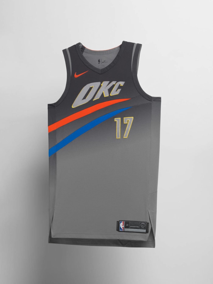
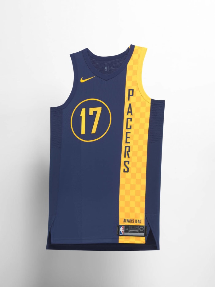
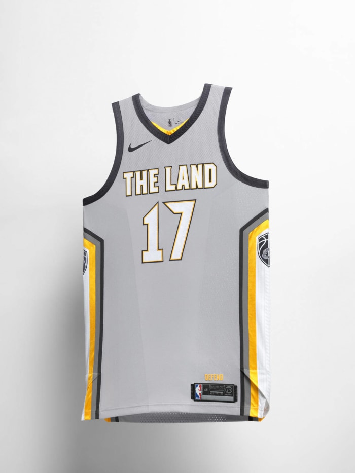
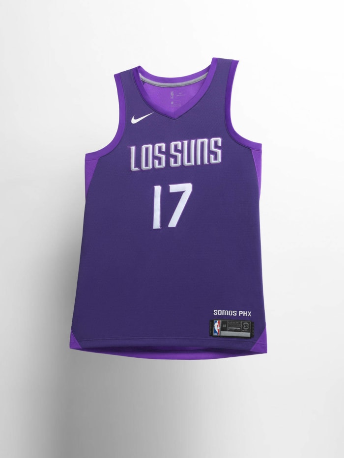
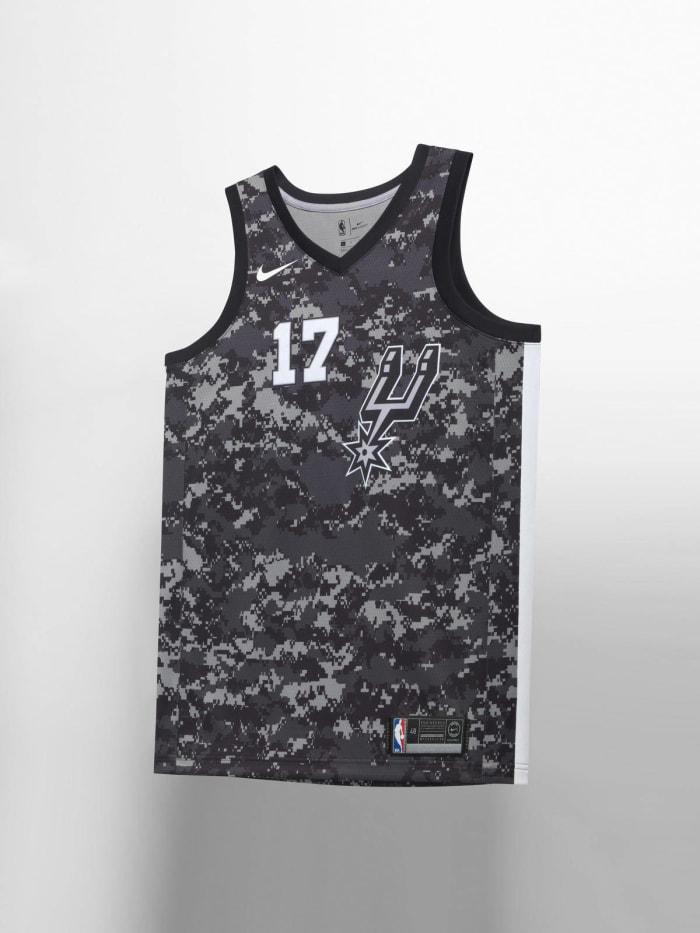
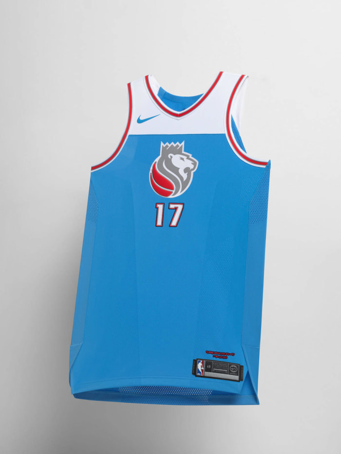
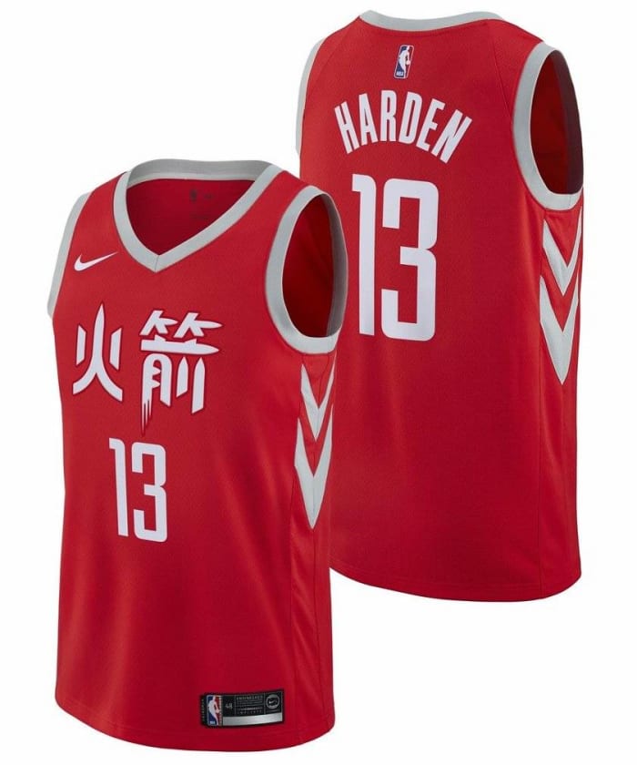
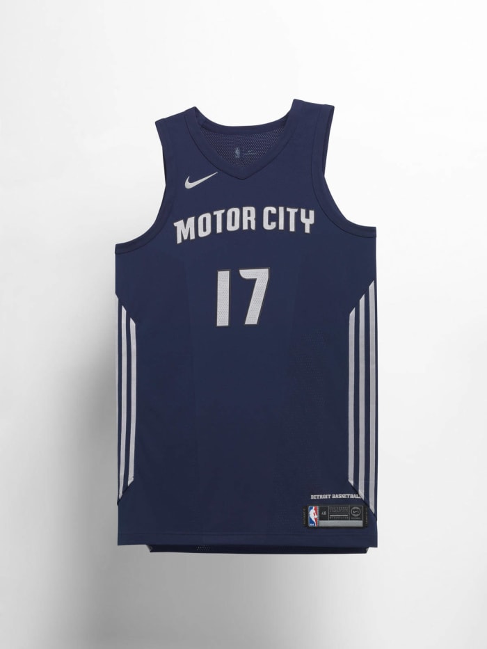
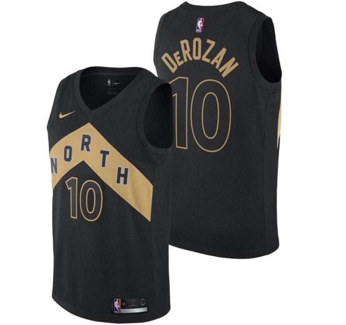
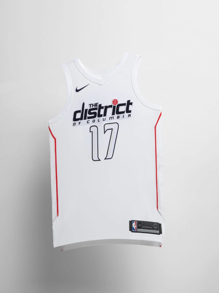
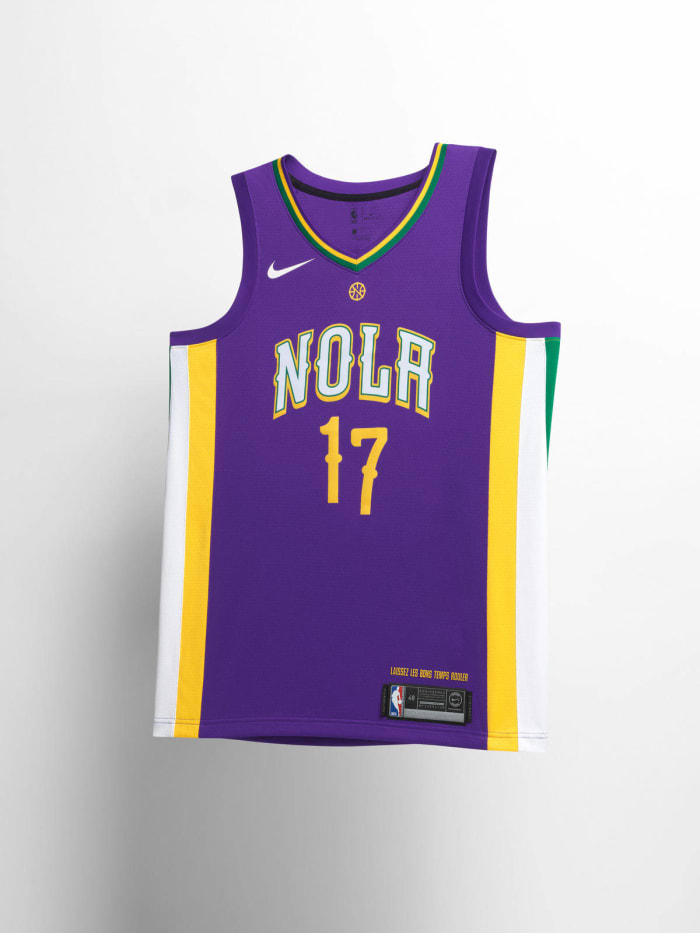
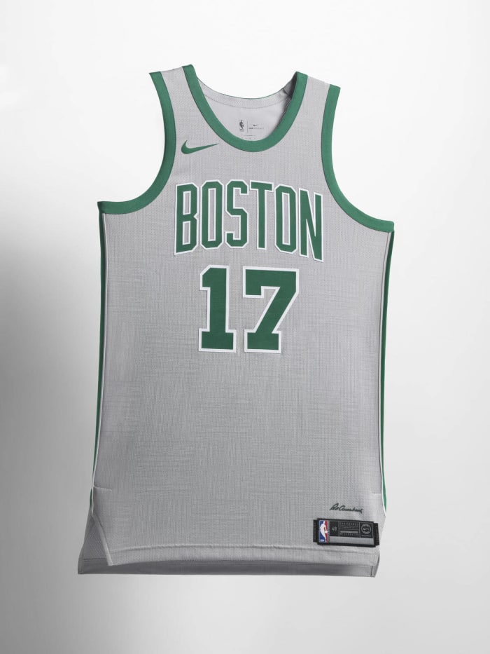
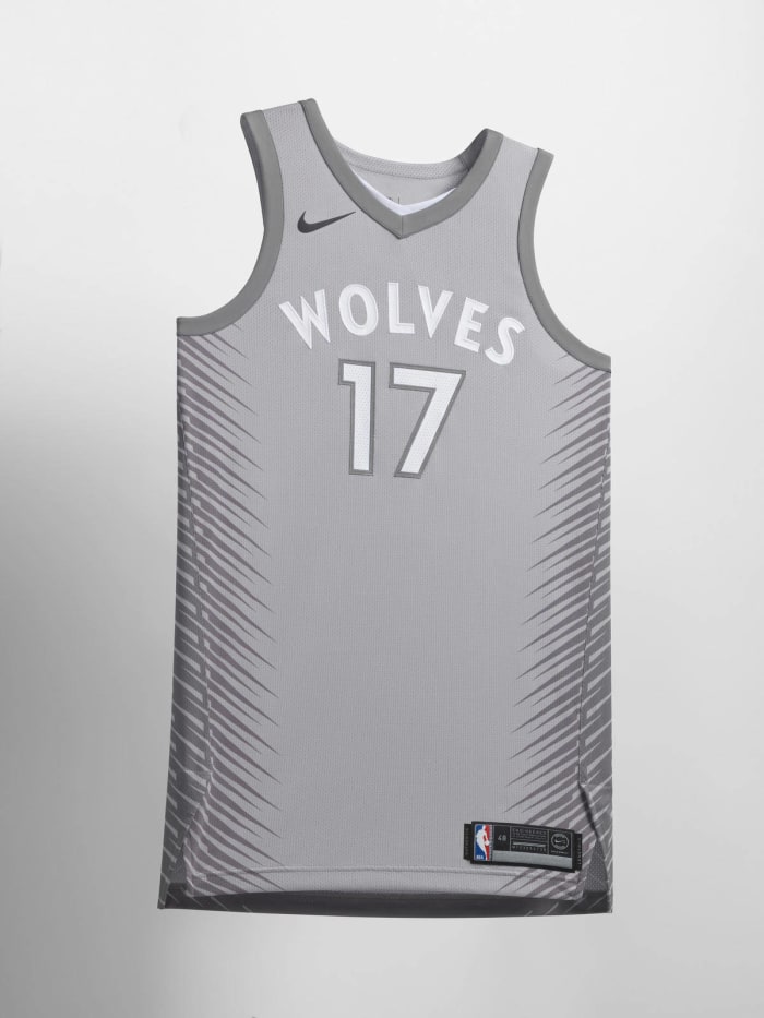
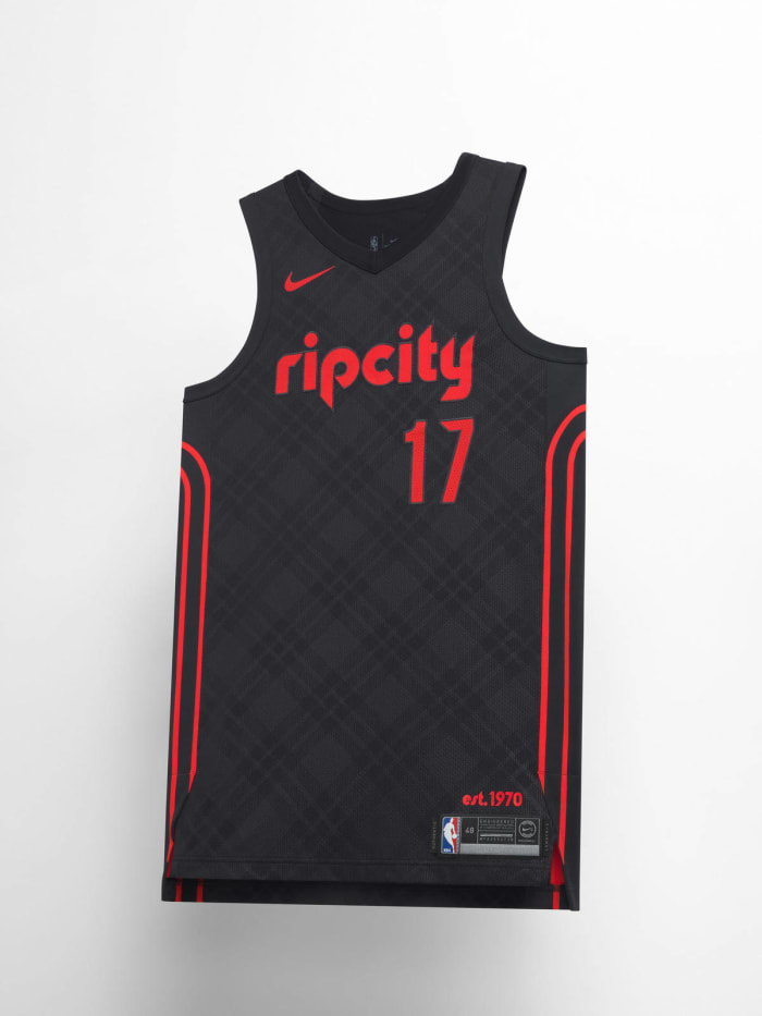
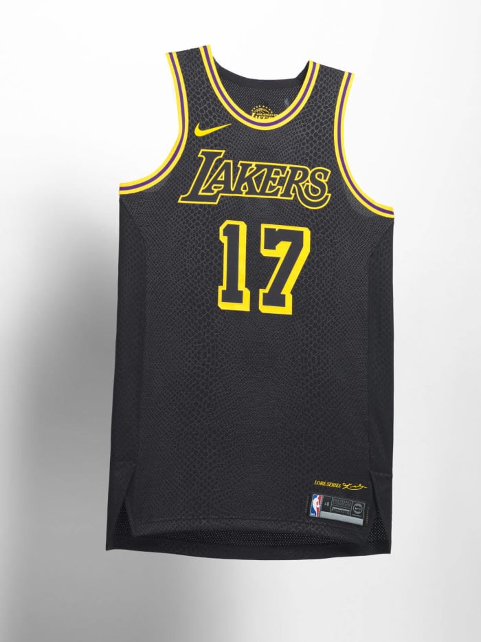
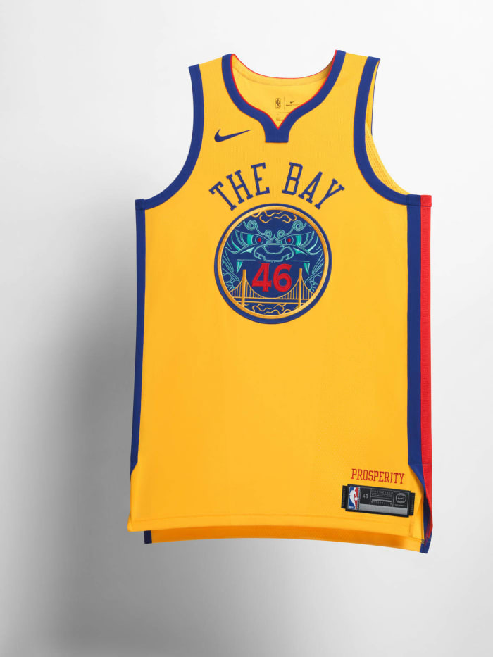
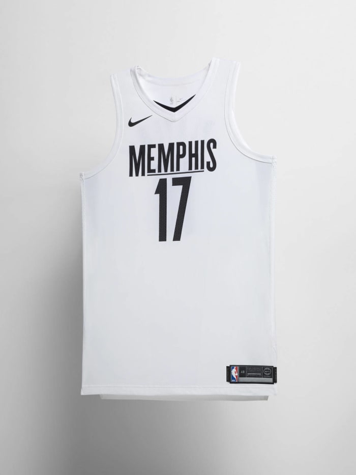
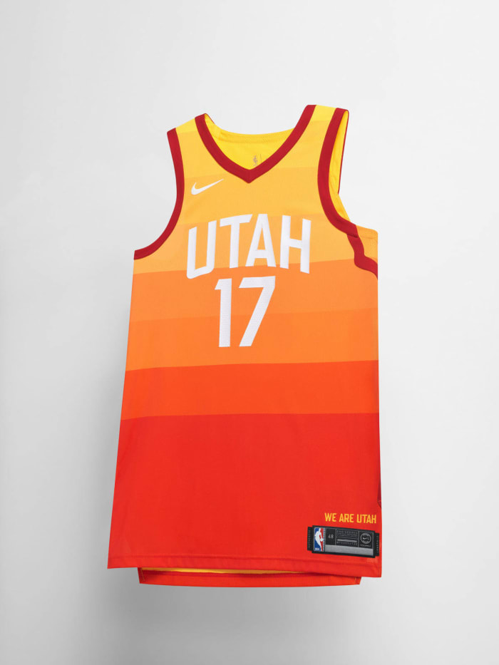
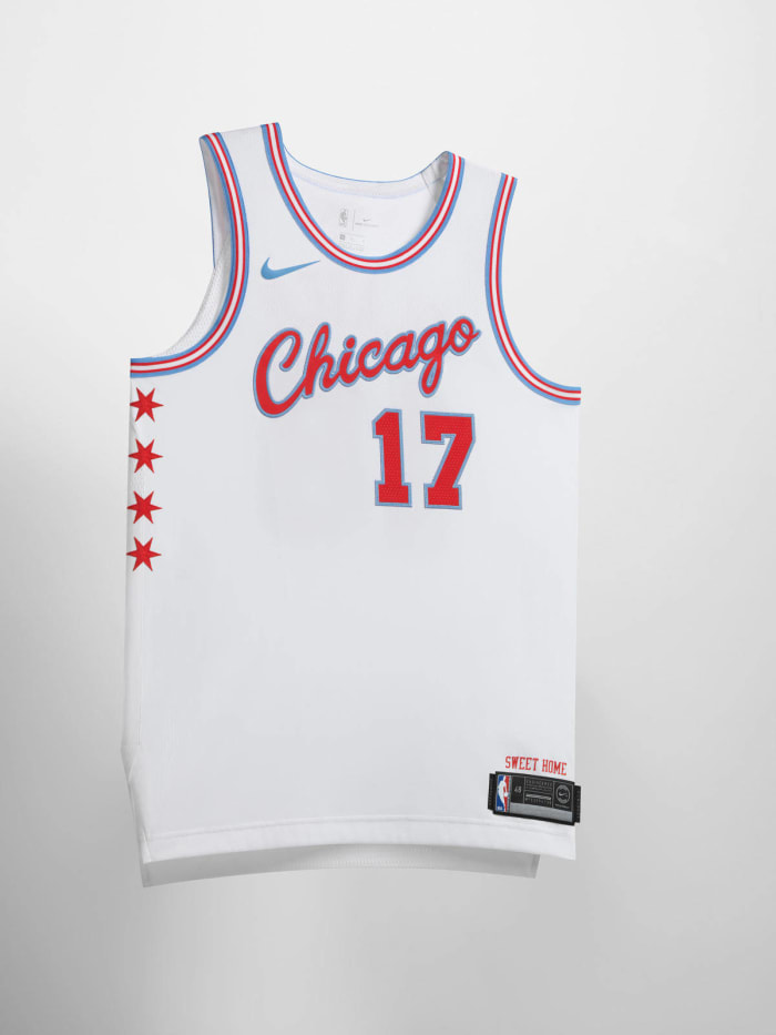
Ranking the 2017-18 NBA 'City' uniforms
Nike and the NBA have released the annual "City" edition uniforms for all 30 NBA teams. Now it's time to rank the jerseys from worst to best.


More must-reads:
- Kobe Bryant talks Lakers jersey designed in his honor
- Sixers got TJ McConnell ‘White Iverson’ jersey for Christmas
- The 'Most points in a playoff game by team' quiz
Breaking News
Customize Your Newsletter
 +
+
Get the latest news and rumors, customized to your favorite sports and teams. Emailed daily. Always free!
This site is protected by reCAPTCHA and the Google Privacy Policy and Terms of Service apply.